Kresta Design
Reinventing Space

Although they claim they don’t ascribe to any particular style, the furniture designed by Madrid-based studio Kresta has a personality of its own. With iron-forged elements and a colour palette that enlivens spaces, completely changing their intention, their pieces are more artistic than they are intended for industrial production. Each piece aims to transcend utility, that’s why they conquer the aura of any living room.
"Every good craftsman conducts a dialogue between specific practices and thinking," sociologist Richard Sennett said about craftsmanship. Architects Cristina Domínguez Lucas and Fernando Hernández-Gil support this idea, which also informs Kresta Design, a furniture brand born to bring a more humane approach to their work. The name speaks for itself [Kresta comes from ‘cresta’, which means ‘comb’]. It alludes to the brand’s logo, inspired by a rooster mask Cristina owned as a child. “The brand was born with a more ludic, funnier vocation than that of our daily professional work. That's why we’ve used the comb from that childhood costume.” In addition to having fun with what they do, the creative duo sought to create unique pieces. “We think furniture is more human than space. We created the brand to response to that need,” she explains.
What began as a tailored solution to customer requests, has taken on a life of its own. "At first we only designed for projects, but then the pieces started working very well on their own," says Fernando, the other half of the team. Until now, they say, the creation process was contingent upon orders being placed, but things are about to change. The launch of a website marks the beginning of a new phase for the company. “We want to structure our designs in a certain way and lend the product a certain logic. For example, our next project features pieces inspired by nature: a praying mantis- and an ant-shaped chair,” he adds.

Cristina Domínguez Lucas and Fernando Hernández-Gil, founders of Kresta Design. © C. Cortés
Your furniture moves away from mass production. Your philosophy is closer to crafts and art than it is to industrial design. How does this fit into the current landscape?
Cristina: Our furniture pieces are created on a small scale, which gives us more creative freedom. They’re closer to arts and crafts. When we design, we try to maintain an ongoing communication with manufacturers, which gives us the chance to experiment. No chair is equal to one another, they all have a meaning of their own, they resemble static animals. For example, if you put a mantis chair in a room, it will take over the space because it has a lot of personality.
Fernando: Our objects are more related to representation, image and meaning than to the act of sitting. They must have a value beyond functionality. From a business perspective this sounds awful, but a different approach would lead us to a situation we have no control over. We aren’t a brand that designs furniture to sell thousands of units, it’s just a fun project that runs parallel to what we do in architecture and interior design.
However, the main material you use is closely linked to industrial and mass production.
Fernando: We work with iron because it allows us to solve several issues at once. It’s a simple, resistant material that is suitable for both indoor and an outdoor furniture. For our first outdoor furniture pieces we worked with blacksmith artisans. We found out that this material adapts very well to the shapes and ideas that we have in mind. Although we don’t rule out using other materials and we’re always trying new things, for the time being we’re harnessing all its potential. It’s a familiar material that has been used since the Bauhaus’ iron tube. We wanted to give continuity to those origins and, although it’s been developed quite a lot, it still offers many possibilities to create different elements.
Iron takes on another dimension thanks to the use of color. What’s the intention the colour palette of your pieces?
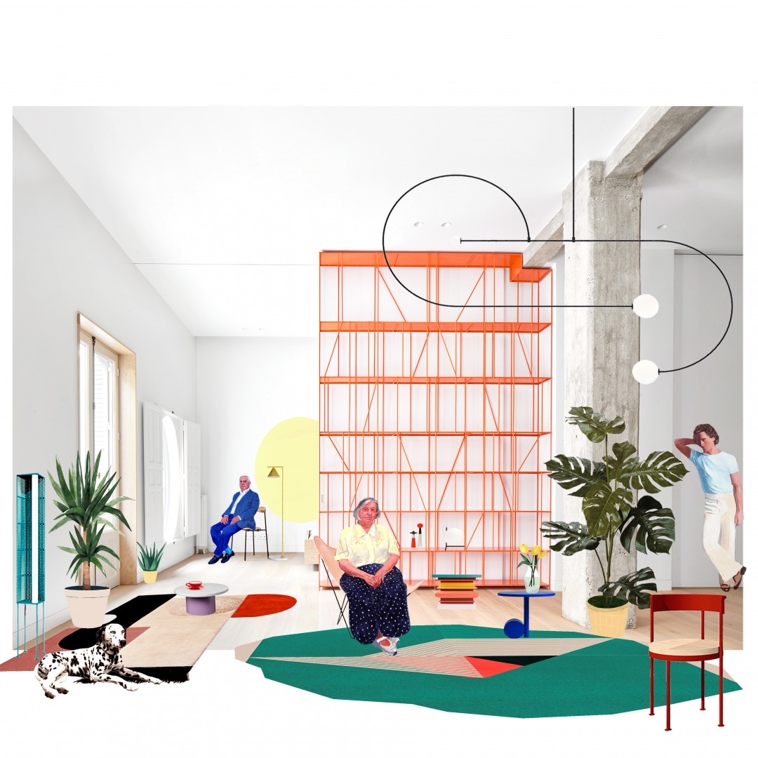
Fernando: We like to use color in architecture, although chromatic decisions are very determining in that field, so we prefer objects to enliven and heighten the space. A small gesture has great impact in the aura of an environment.
Cristina: It's like when you open a piece of fruit and suddenly color appears. The same happens when you enter a living room and see an orange piece of furniture.
Fernando: From a methodological perspective, colour helps establish a center, an axis of interest, and enhances a particular corner. It’s very useful. Colour and light are essential when it comes to designing. Many of our projects use more neutral palettes, but colour is always very important because it enriches space. The leitmotiv of the Casaplata Restaurant, in Seville, was exactly that. It’s a place with a uniform, silvery gray background where furniture gains prominence through colour. We draw inspiration from Morandi’s still lives.

A Kresta Design project for Madrid’s P82 house. © Courtesy of Kresta Design
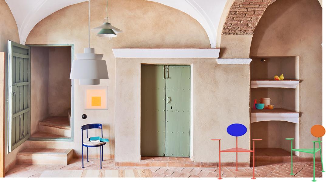
Your objects are somewhat antagonistic with space. That becomes apparent, for example, in the country house in Villalba de los Barros, in Extremadura. Do you like to establish a dialogue between the legacy of the buildings and your furniture?
Cristina: There’s so much contrast the furniture pieces enhance the space’s original architecture and vice versa. The play of opposites is something we always discuss in the studio because we think they boost one another.
Fernando: The colours in that house are the colour of Tierra de Barros’ construction materials [‘barro’ means ‘mud’ or ‘clay’]; both the floor and the walls are clayey. We added greyish greens to the carpentry to represent the vineyards, as well as present-day furniture objects. We tried to respect the original atmosphere without mimicking it or doing something too vintage. The space works when you add a modern piece of furniture because it preserves the heritage, the spirit, the simplicity and the roundness of forms, and it dialogues very well with what is already there.
Many of your pieces have wheels or are easily manageable. Is portability one of your cornerstones?
Cristina: We do have mobility into account. A large piece of furniture is more adaptable if it comes with wheels. Moreover, we like the idea of them being easy to transport.
Fernando: Aesthetically, it concurs with our idea of making versatile furniture.


